Krause Architects
A new refined look for the London-based design and architecture studio.


The Client
KRAUSE ARCHITECTS is a London based studio for urban design, architecture, interior and product design. The studio has an international reach with projects in the UK, Europe, Middle East, Africa and Asia. KRAUSE ARCHITECTS current projects range in size from a 260,000m2 master plan, to numerous high-end residential towers, and villas – to the scale of luxury apartments and interiors.
The Brief
When KRAUSE ARCHITECTS came to us their brand identity looked dated and not refined enough for their large-scale international client base. The practice wanted a new look that even though was to be kept super-simple in terms of appearance, it needed to be more considered and innovative to reflect their style of work.
Our Thinking
We created a new logo utilising a font with a wide range of weights, to be used for both the main logo and sub copy; this enabled us to keep a consistent feel across all material moving forward. The font chosen was both beautifully crafted and balanced in terms of design, but also very innovative and forward thinking to answer the practice's brief. Stacked capital letters of the logo reflected the built, architectural nature of the business, whereas the sub font employed upper and lower case in the thin weight to be modern and elegant.
Delivering Results
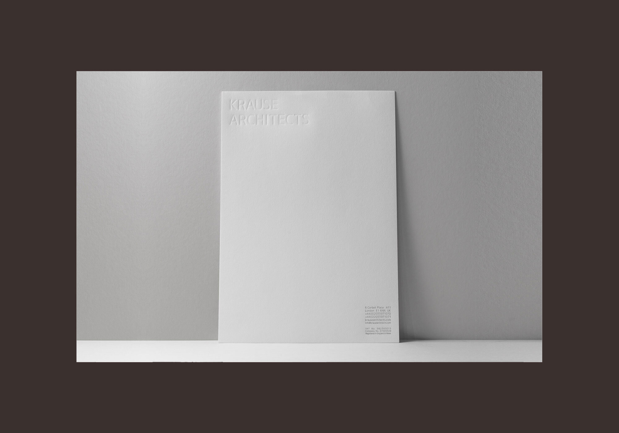
With the identity finalised we designed a range of stationery that was kept super-simple in appearance. We chose classic letterpress printing as we felt it this method would showcase the practice as very considered yet innovative. Using a sustainably sourced stock, we supported the client's environmental values and their desire to continually improve the built environment.
